

Since we started our educational series of articles about the crypto market, we've constantly advocated DYOR (do your own research). It's a crucial step in crypto trading, as it is before you delve into anything crypto-related. Before deciding to invest your money in a particular coin or building a portfolio of crypto assets, you must understand the market sentiment, how the crypto market is performing, and the price trend, amongst other things.
You're probably wondering right now how these factors can be studied. It's easy; you can discover the market trends if you read crypto candlestick charts. What are they? That's what we're learning today.
What is a candlestick chart? - Brief history
Crypto traders have a technical tool that they can use to analyze and anticipate the price movement of any token in the market. It's called the candlestick chart, and it's been around for roughly 300 years.
Traditional Japanese candlestick charts
Back in the 1700s, a Japanese rice merchant called Monehisa Homa invented the candlestick charts. He discovered that the price of the product was dictated by supply and demand, and also, the emotions of the Japanese rice traders had a significant factor in the price changes. The Japanese candlesticks used basic elements (Open High and Close Low) to represent the price in the trading period. Over the centuries, Homma's initial candlestick charts were refined, most notably by Charles Dow, one of the founding fathers of technical analysis, to the model used nowadays.
How a candlestick chart looks
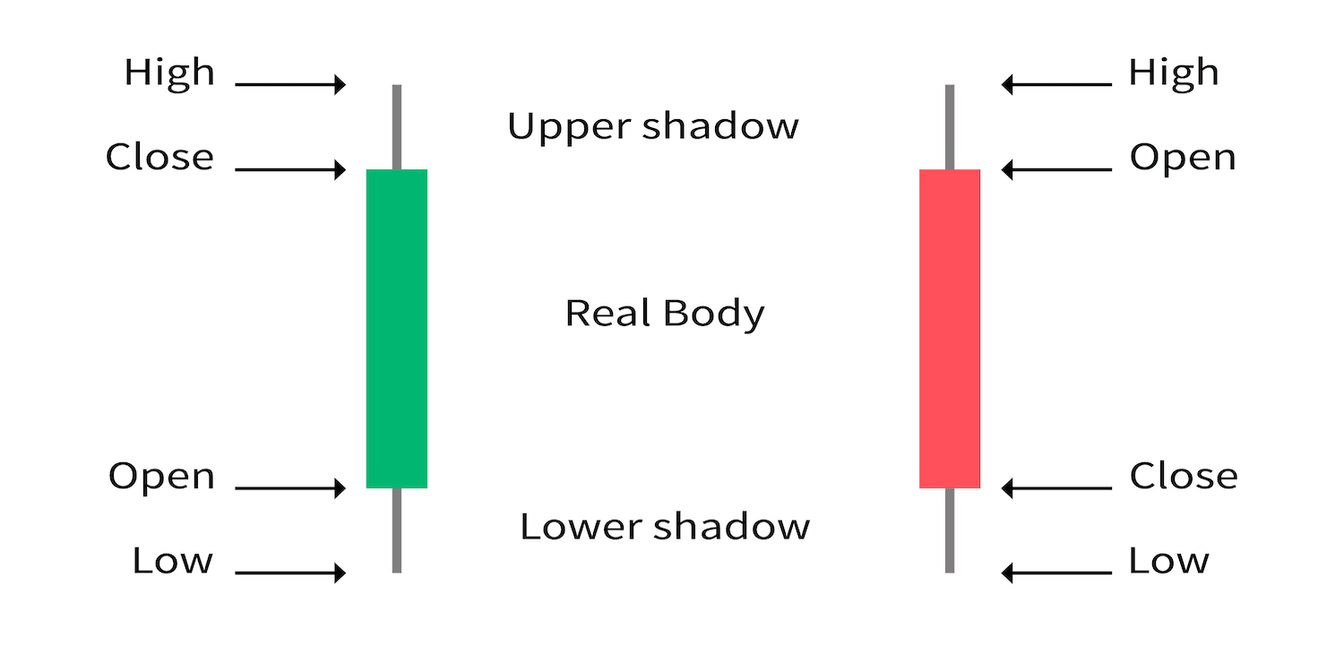
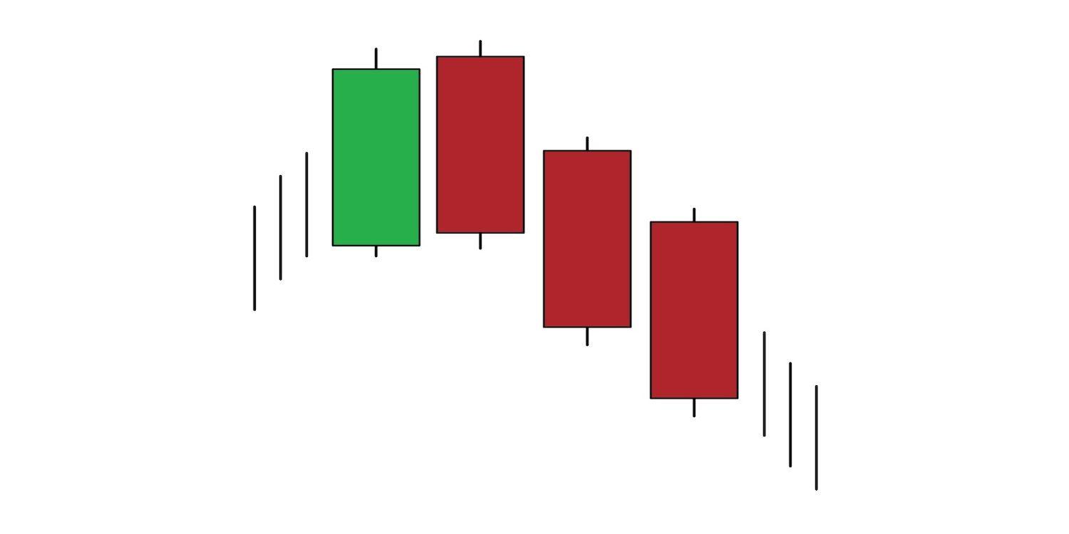
A candlestick has four main components that visually represent the price movement of an asset during a given timeframe: the open, close, high, and low. Open refers to the opening price of a particular asset at the begging of a trading period, while the close represents the closing price at the end of the same trading session. The high and low refer to the highest and lowest prices obtained during the trading period. Every candlestick comprises a body and wick, features that help display the four main components.
Candlestick body: The candle's body is the wide midsection of the candlestick, and it shows the open and close during the observation timeframe. The close appears at the top of the body in the green candle and the bottom of the body in the red candle. The open forms the opposite way, on the bottom of the green candlestick and the top of the red one.
Candlestick wick: Wicks appear as the thin lines above and below the body. This is where you will find the visual representations for the highest price and lowest price.

Reading candlestick charts
Now that you know what candlestick charts are and how they look, it's time to move on to the next step. Get ready to read candlestick charts like a pro trader in no time!
Two price patterns can be shown through a candlestick chart: the bullish pattern and the bearish one. The bullish pattern represents an upward price movement, while the bearish pattern represents the opposite, a downward trend in prices. Since bullish and bearish market trends can influence your trading strategy, it's vital to gauge market sentiment by interpreting the candlestick chart pattern. Need a refresher on crypto bull and bear markets? Read our article on the subject and get up to speed.
Bullish candlestick
A bullish candle, also known as a green candle, forms when the opening price of a candle is lower than the closing price of the same candle. The bullish candlestick shows an asset's price increase.
Bearish candlestick
A bearish candle, or red candle, forms when the closing price is lower than the candle's opening price. The bearish candlestick indicates a price decline in the asset's value.
Reference timeframes
Candlestick charts work within predetermined timeframes. The daily ( 1 Day) timeframe is very popular in crypto trading. The candlestick forms at the beginning of the day and is fully formed at the end of the day (open and close prices). Various candlesticks will be lined up next to each other, creating a 1-day candlestick chart. There are also other popular timeframes that you should know about:
1-minute (1m)
5-minute (5m)
15-minute (15m)
30-minute (30m)
1-hour (1H)
4-hour (4H)
Daily (1D)
Weekly (1W)
Monthly (1M)
Timeframes are important because they give a closer or broader view of the price action. Imagine looking at a 1-day candlestick chart. If you change the timeframe to 1 hour, the candlesticks will multiply by 24. Basically, for every 1-day candlestick, you will get twenty-four 1-hour candles. Choosing a larger timeframe offers you a bigger perspective. In a weekly chart timeframe, every candlestick shows a seven days timeframe. That means seven daily candlesticks grouped to form a single weekly candlestick.
Candlestick chart patterns explained
Many candlestick patterns can appear on a chart, and knowing how to interpret them is crucial. These patterns can be divided into single, double, and triple candlestick patterns, representing various market trends. All patterns show price trends, either a bullish trend or a bearish trend, as well as momentum. Traders can see several data points like the opening and closing price or a cryptocurrency's highest and lowest price.
Single candlestick pattern
The single candlestick pattern refers to any pattern that contains only one candlestick. Understanding the single basic candlestick patterns will also help you read the double and triple ones.
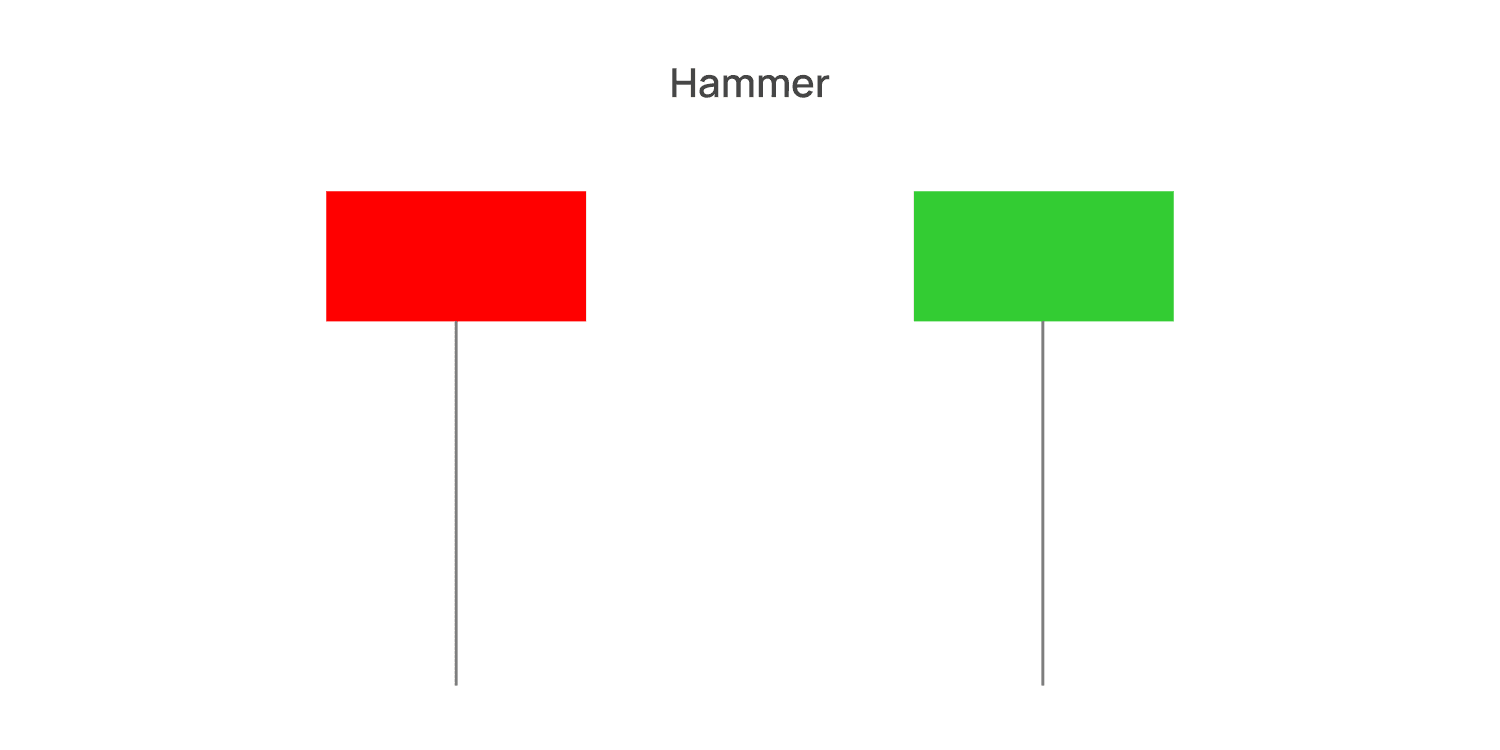
The Hammer Candle: The hammer candlestick pattern is a bullish reversal candlestick pattern. The wick of the hammer candle is lower and longer, two times the length of the body. This candlestick pattern usually forms at the end of a price reversal downtrend. The body of the candle can be both bullish or bearish, but traders consider it more powerful when it is a bullish candle.
The Inverted Hammer: The inverted hammer candlestick represents a reversal pattern from the previous candle. The upper part is a long wick, and the bottom part is a short body. It appears during a bearish trend and indicates an upcoming price reversal.
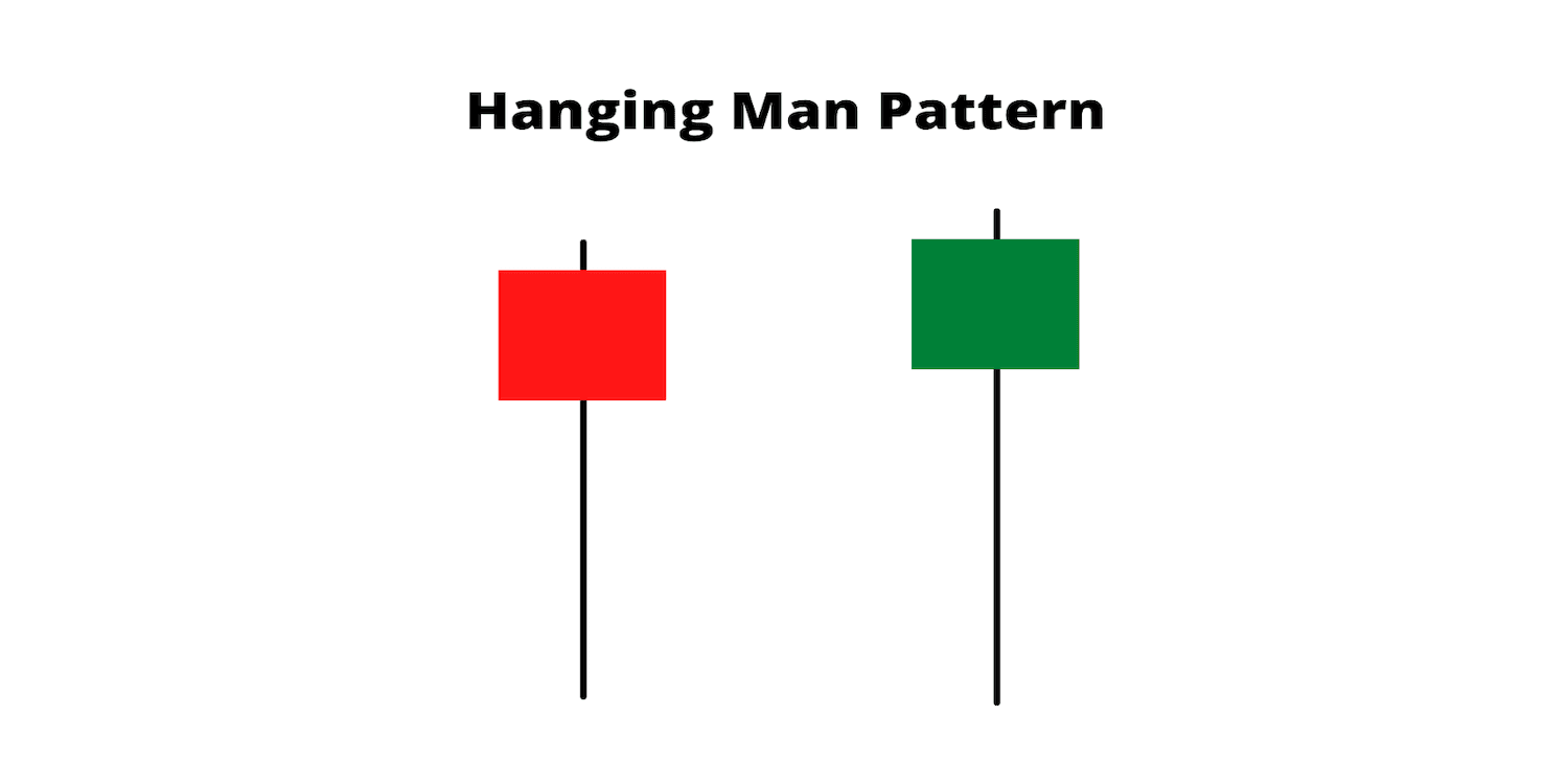
The Hanging Man: This candlestick pattern is similar to the hammer one, indicating the end of a bullish market trend and the beginning of a bearish market.
The Shooting Star: When you read a candlestick chart and see a shooting star, it indicates a possible reversal of an upward surge. The wick is longer than the body, and it's located on the upper side. Although the body can be both bullish and bearish, the pattern is stronger when the body is bearish.
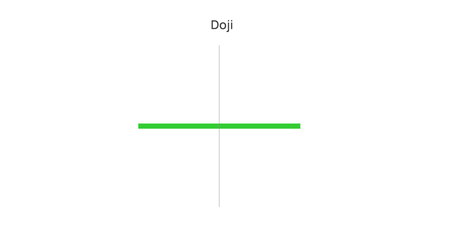
The Doji candlestick: This candlestick represents the change in sentiment of a particular trade. The Doji pattern has a very tiny body and a long wick.
A Spinning Top: This pattern emerges when the price data shows little market movement. The body is short, and the wicks on either side are almost identical in length.
Double candlestick patterns
As the name states, the double candlestick patterns have two candles. Let's see some of the most common patterns that can appear on a price chart:
Bullish engulfing pattern: This double pattern indicates a strong uptrend in price direction. It predicts that the price of the asset is moving beyond its prior highs and lows.
Bearish engulfing: This is the opposite of bullish engulfing. The red and green double candlesticks signal the lows of a price trend and strongly bearish sentiment in a trade.
Bullish harami: A Bullish Harami candlestick forms when a large bearish red candle appears on Day 1, followed by a smaller bullish candle on the next day.
Bearish harami: A Bearish Harami candlestick appears when there is a large bullish candle on Day 1, followed by a smaller bearish candle on Day 2.
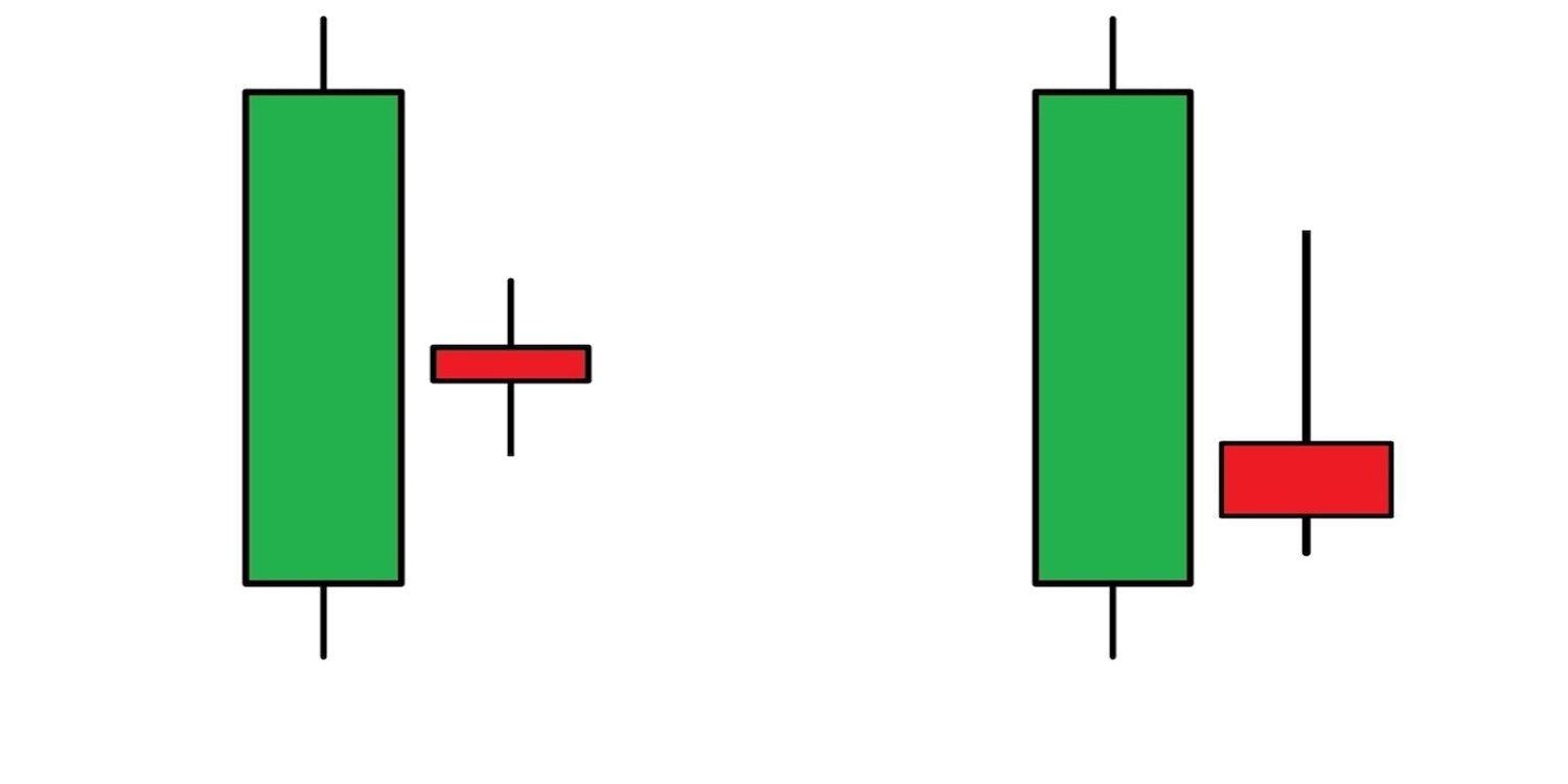
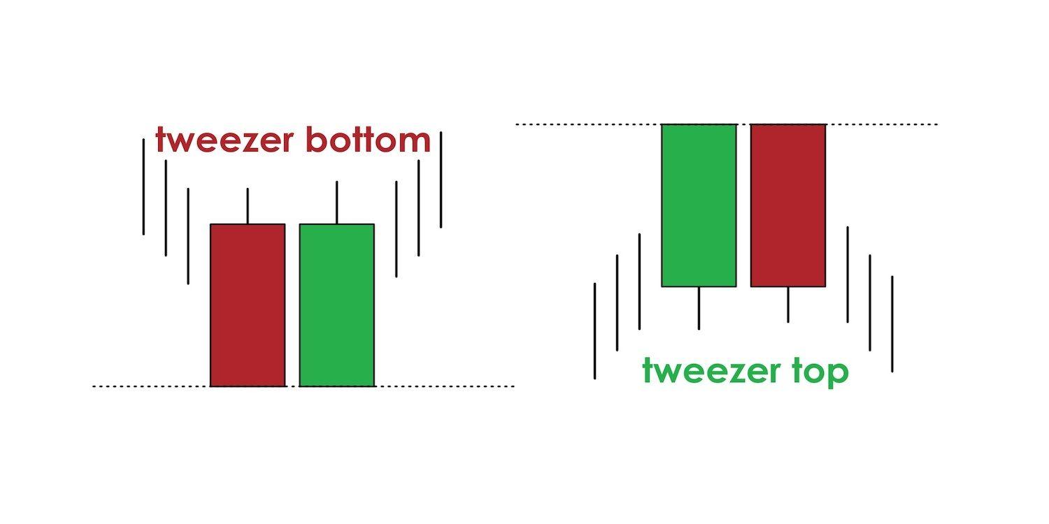
Tweezer top: A tweezer top pattern appears when the highs of two candlesticks occur at almost the same level following an advance.
Tweezer bottom: This pattern emerges when two back-to-back candles occur with very similar lows.
Triple candlestick patterns
Last but not least, we have the triple candlestick patterns comprised of multiple candles.
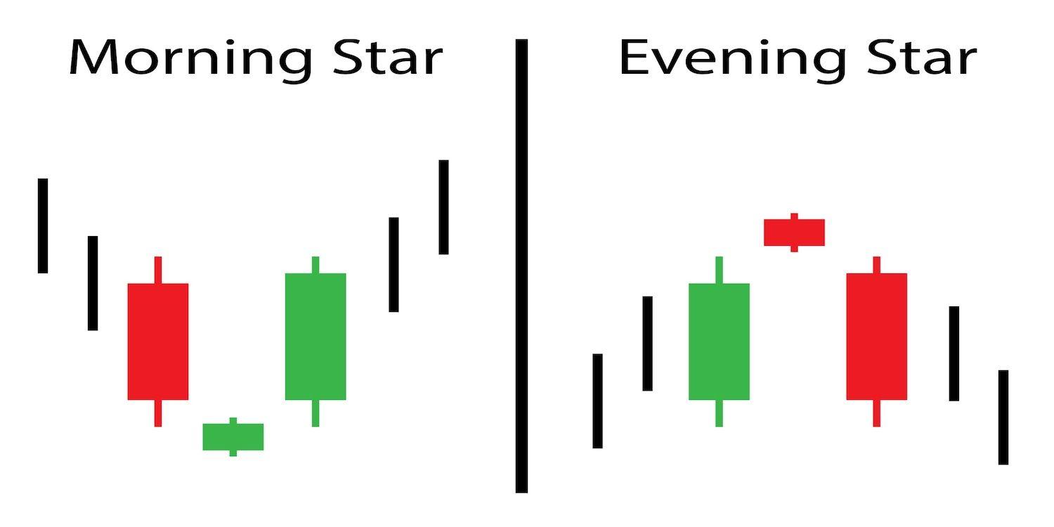
Morning star: It's a triple pattern that appears during a downtrend showing a significant shift from past price movements. It's a reversal candlestick pattern representing the start of a positive trend. One of the three candlesticks functions as a market survey.
Evening star: Another triple pattern that appears at the end of a bullish trend, signaling that the price action is starting to go downwards. One of its candlesticks also surveys the market trends.
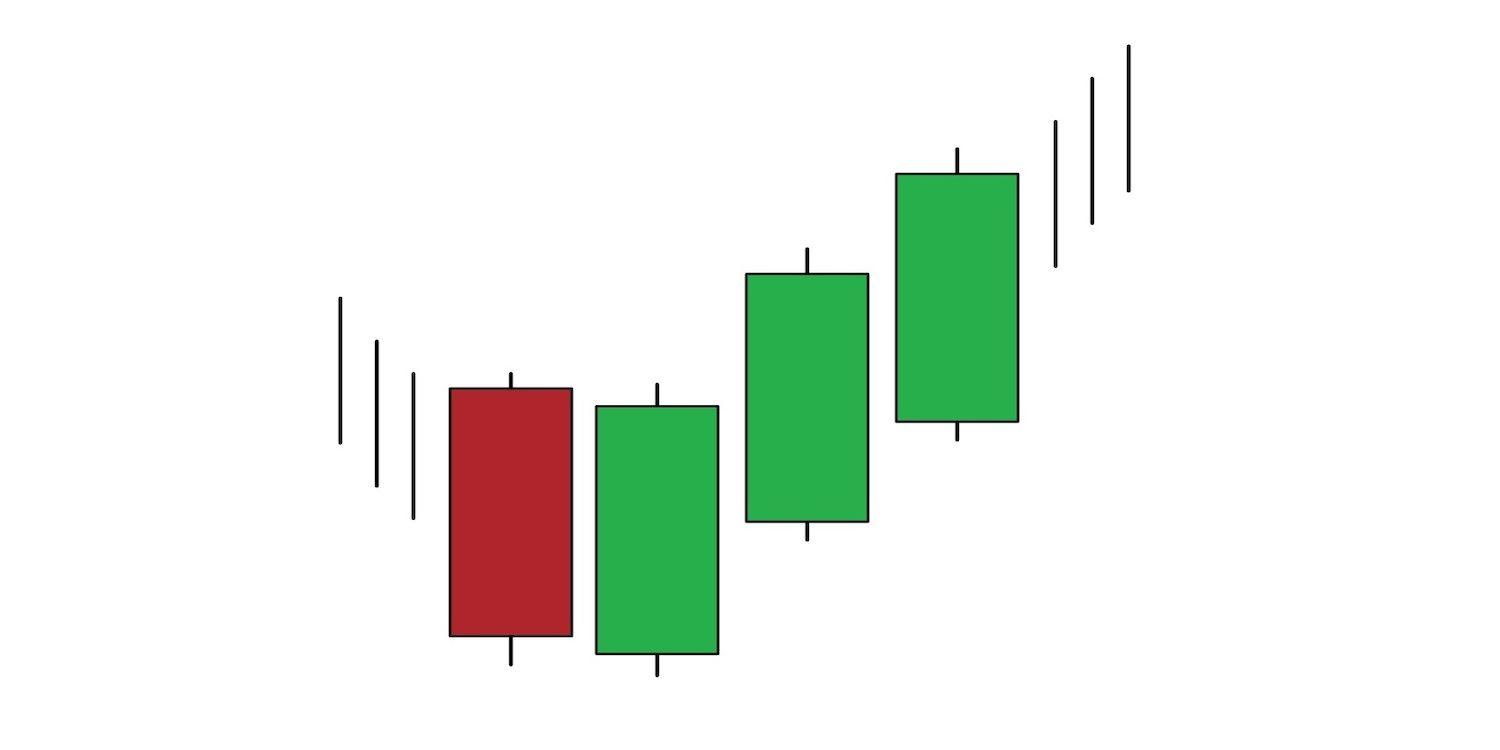
3 white soldiers: Three white soldiers is a bullish candlestick pattern used to predict the reversal of the current downtrend in a pricing chart. The pattern is represented by three consecutive long-bodied candlesticks that open within the previous candle's real body and a close that exceeds the previous candle's high.
3 black crows: This pattern emerges at the end of an uptrend after there has been an extensive unstable momentum. It is a reversal pattern that suggests that the market will turn from bull to bear. It consists of three consecutive long-bodied candlesticks that have opened within the real body of the previous candle and closed lower than the last candle.
Knowing how to decipher candlestick charts and understand the meaning of several pattern combinations that can emerge on the chart from day to day can make the difference between a seasoned trader and a newbie. When you are fine-tuning your trading strategy, be on the lookout for open and close prices of a specific asset, study the financial markets for signs of bullish or bearish trends, and make sure you understand any minor price movement. You can rely on the red and green candles as almost all traders worldwide focus on the candlestick chart as a crucial price action tool that can increase trading probability.
Let’s stay in touch:
🐤 Twitter:https://twitter.com/winplatform
💬 Discord: https://discord.gg/pUJWEEKTpr
🦄 Telegram:https://t.me/winplatform